Mondzorg Meerssen.
Identity. Print.
Mondzorg Meerssen is a new, modern practice where there is plenty of attention for the patient in a friendly atmosphere. A broadly trained team of dentists, dental hygienists, (para-) prevention assistants and dental assistants work closely together to provide the best care.
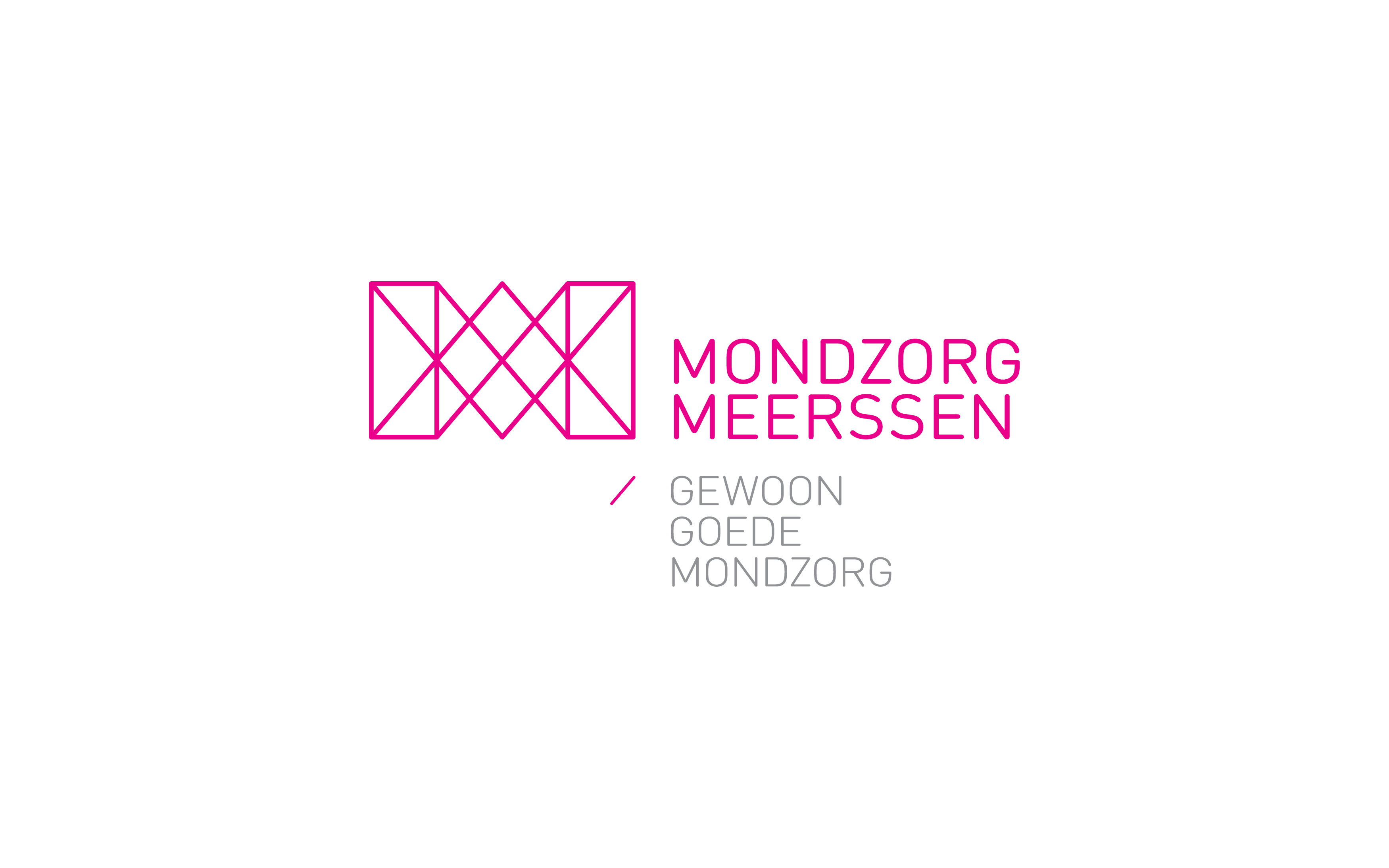
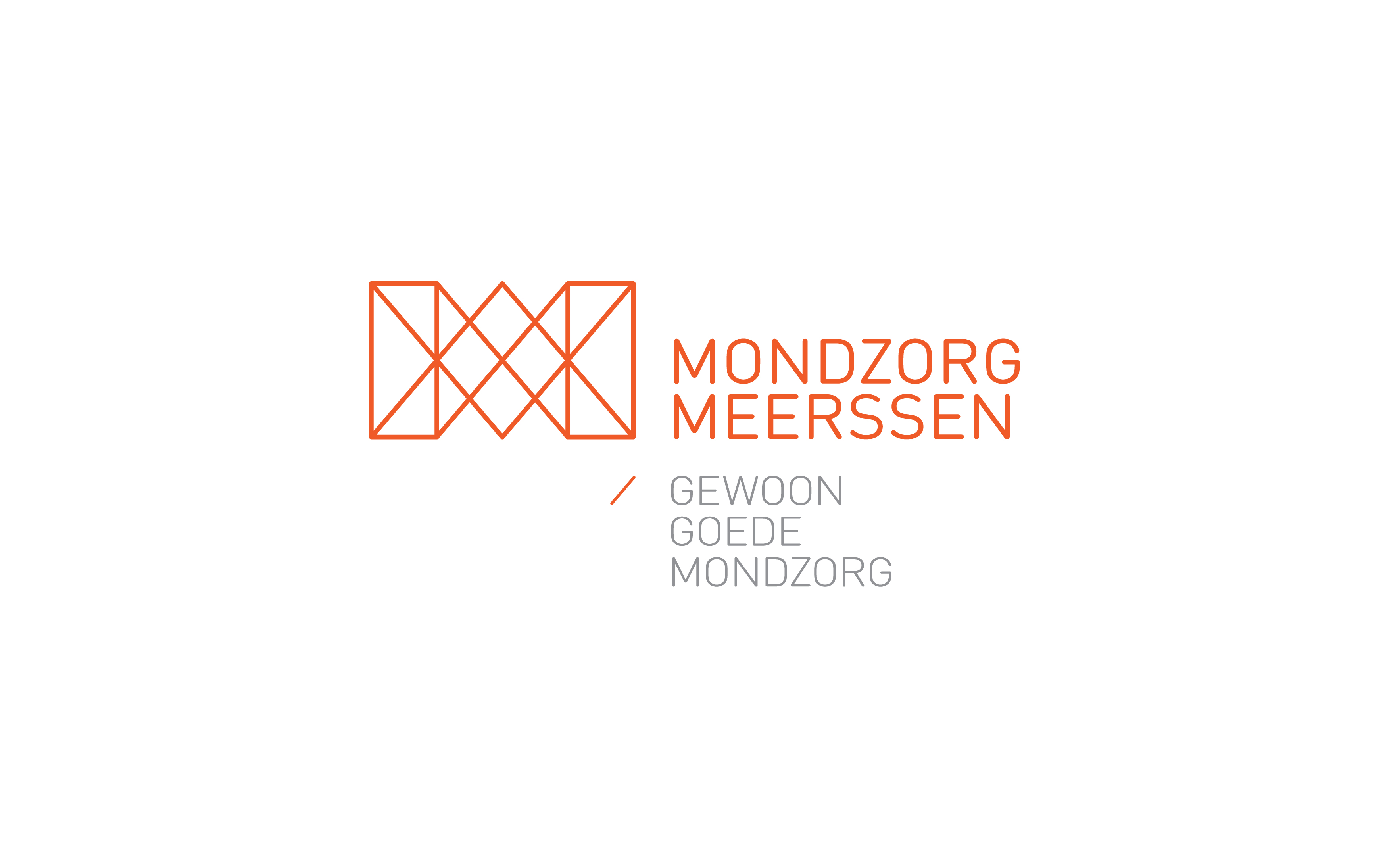
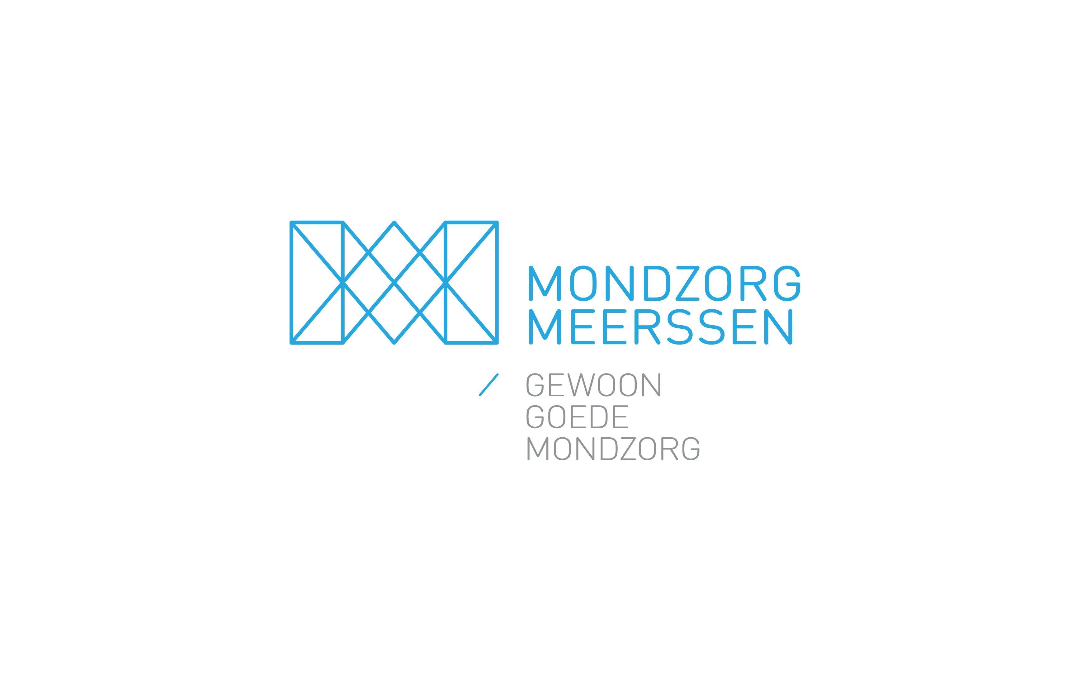
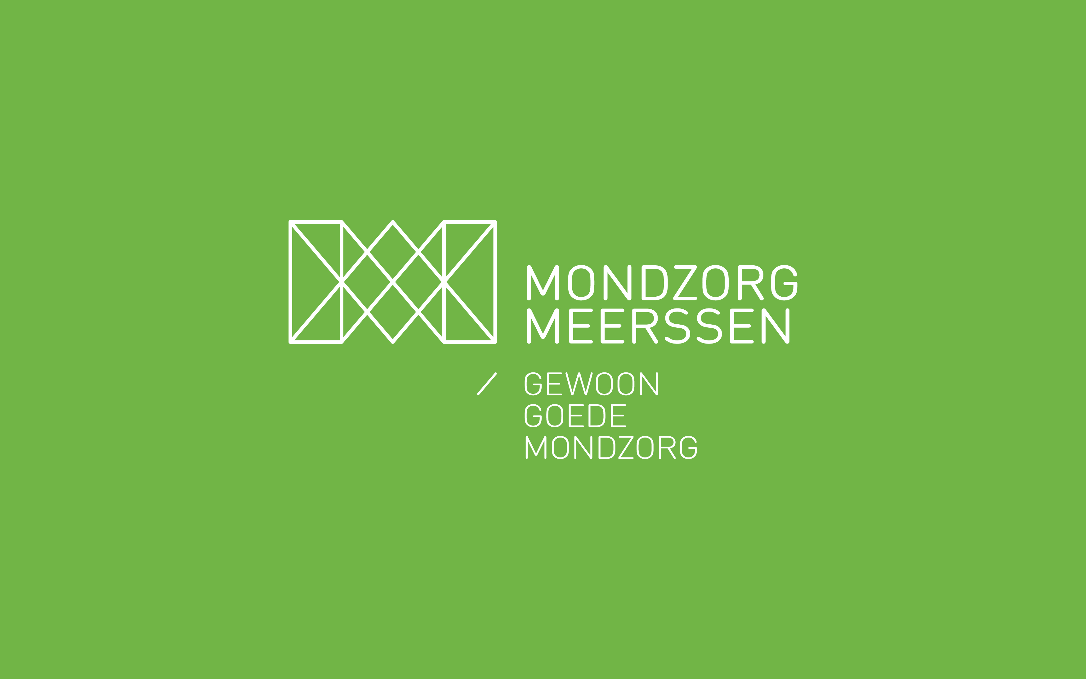
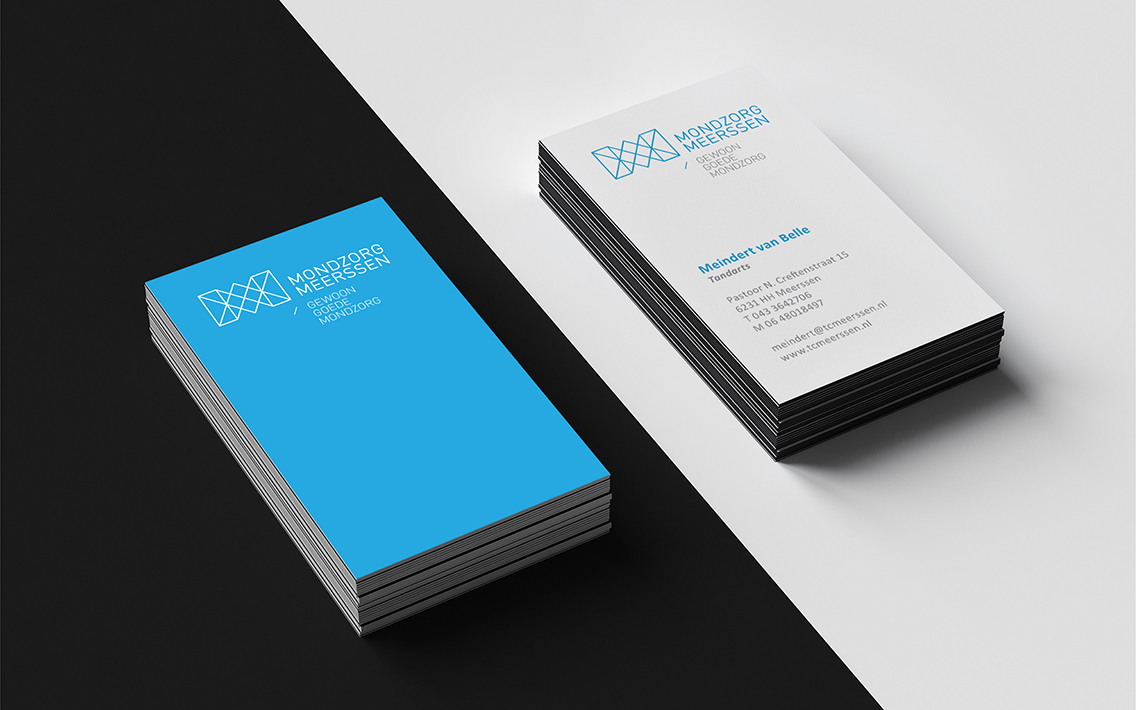
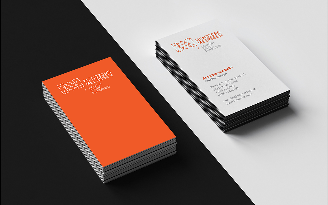
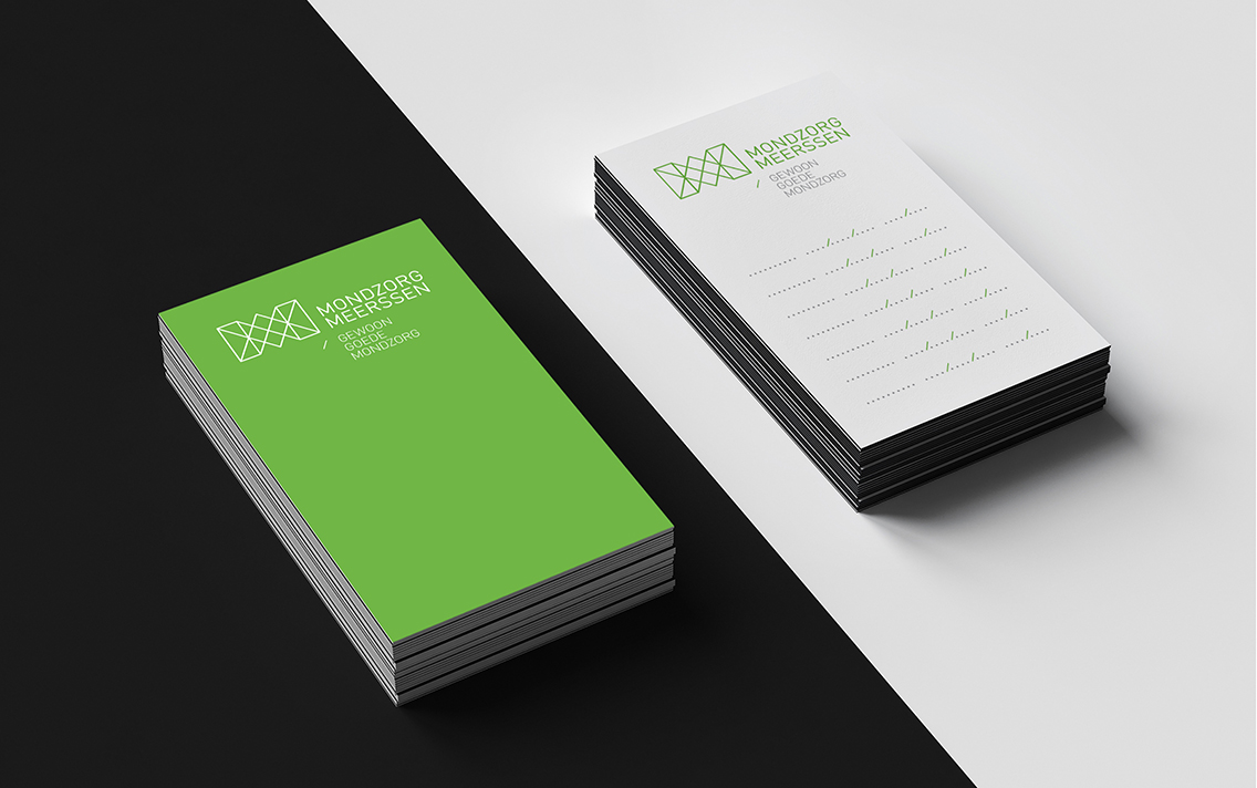
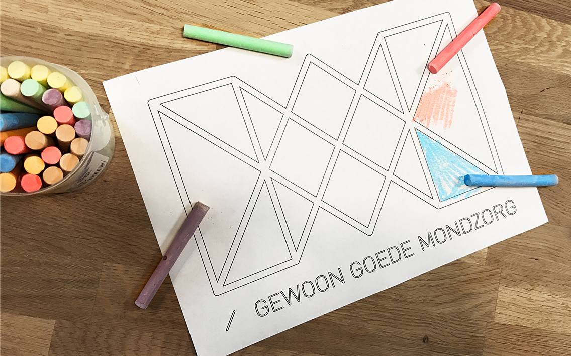
We have developed a new logo and new corporate identity for Mondzorg Meerssen. Two Ms connected to each other. Symbol for the connection with the patient and with a visual wink to the teeth. The different colors represent the diversity of the care offer.
![](https://we-rs.com/gateway/2017/04/mondzorgmeerssen_presentatie-21.jpg)
![](https://we-rs.com/gateway/2017/04/mondzorgmeerssen_presentatie-17.jpg)
![](https://we-rs.com/gateway/2017/04/mondzorgmeerssen_presentatie-19.jpg)
![](https://we-rs.com/gateway/2017/04/mondzorgmeerssen_presentatie-15.jpg)
![](https://we-rs.com/gateway/2017/04/mondzorgmeerssen_presentatie-18.jpg)
![](https://we-rs.com/gateway/2017/04/mondzorgmeerssen_presentatie-22.jpg)
![](https://we-rs.com/gateway/2017/04/mondzorgmeerssen_presentatie-20.jpg)
![](https://we-rs.com/gateway/2017/04/mondzorgmeerssen_presentatie-26.jpg)
![](https://we-rs.com/gateway/2017/04/mondzorgmeerssen_presentatie-25.jpg)
![](https://we-rs.com/gateway/2017/04/mondzorgmeerssen_presentatie-27.jpg)
![](https://we-rs.com/gateway/2017/04/mondzorgmeerssen_presentatie-28.jpg)